

ADVOKATFIRMAN WENNERKLINT / LAW FIRM

GRAPHIC IDENTITY
ASSIGNMENT/BRIEF
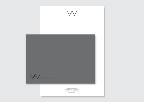
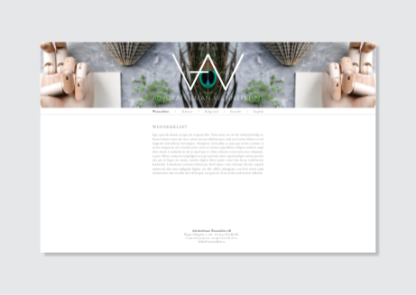
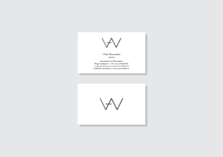
Logotype, typography, collateral including businesscard, letterhead, envelope and website to the new law-firm in business “Advokatfirman Wennerklint AB”.
IDEA AND IMPLEMENTATION
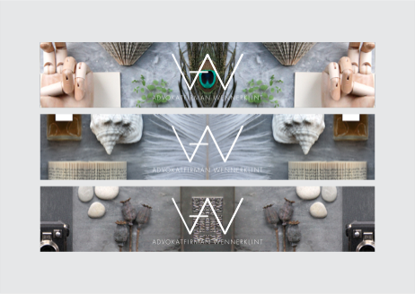
The idea was tom make a symbol that illustrates and clarifies the somewhat long company name. My solution is a stylized W, that symbolises the name as well as it illustrates a pair of scales (the classic symbol to justice) plus a horizontal line that makes an A, like in “Advokatfirman”. Altogether with a traditional typography it balance into a solid unit. The colour scale is white and gray to keep a low profile . The webpage’s visual idea is a untraditional solution in an traditional business. With arranged still-lifes that’s mirrored to give further strenght to the idea/illusion of the scales.
SÅNGE DESIGN | OSKARSVÄGEN 13 | SE-181 32 LIDINGÖ | SWEDEN | +46 [0]70 768 75 36 | INFO[@]SANGEDESIGN.COM

